Thursday, 12 October 2017

Audience Manipulation

AUDIENCE MANIPULATION

Maccies advert audience

- Families
- McDonalds is aimed at younger people - it's relatable 
- targets the working class

Ideology of gurkin advert - love & caring (associated with Maccies) Stereotypical romantic gesture - the man takes care of the woman

What if you watch too much tv? You become "mindless"
If you watch too much youtube or use social media then you could become negatively influenced.
If you play too much videogames you become violent

Mass media : Reaches mass audiences (tv, social media and youtube)
- Nazi party used propaganda to influence people - people became scared of the idea of mass media


Coca Cold Ad

Ideas being cultivated
-Classy drink, sunbathing on a roof above a cityscape
-Leisure drink, makes you more exciting
-Coke brings people together
-Rich people, attractive women, very luxurious life

Hegemony: Where on group wields power over another, not through domination, but through coercion and consent

Hegemonic power e.g. The School System
Non Hegemonic power e.g. Military conquest


Hegemonic Power - Table manners, Curtesy , Respect certain people in society based on their situation (e.g. pregnant women and elderly), wearing clothing (public indecency), public hygiene, wearing makeup & body makeup  

Patriarchal society - male dominated society, we are presented with men's ideology 
Matriarchal society - a society dominated by women

Preferred Reading - Coca Cola is positive and brings people together

Oppositional reading - Coke rots your teeth and causes you to put on weight


Audience Negotiation

Hegemonic Power In These Advert


Adidas Advert

- Received backlash because the model had hairy legs.
- Went against dominant ideology that women should be completely shaved
- She was threatened and received a lot of abuse over the internet, and a lot of men in particular threatened to rape her. Broken Hegemonic rules.

David Money Supermarket Advert

- People complained about it, breaking stereotypes of men
- Advert Producer has decided to challenge stereortypes


Exam Structure

What do you need in an exam?

- Answer the question
- Read the question
- Use the bullet points 
- Use correct terminology
- Underline key terms

Paragraphing - 45 mins for the 30 mark question
 Introduction NEEDED at the start
  Conclusion at the end

Point, Evidence, Explanation & Argument

INTRODUCTION - Definition - key terminology
             - Definite Point of view
             - Context of the adverts

Second Question - 22 mins for 15 mark question


HOW TO ANSWER QUESTIONS 

Read question & underline key terms
Gut reaction - what is your opinion? What argument will you make?
Plan - on the answer paper 
Introduction - CDA (Context, Defintion and Argument) 
3-6 paragraphs  - PEA (Point, Evidence, Argument)


Monday, 9 October 2017

Introduction to audience

Why is media studies so preoccupied with audience?

  • All media needs at an audience - aimed at a certain audience.
  • Without an audience, the product cannot be sold.
  • Generating a reaction is what we are interested.
What is a target audience?

  • The specific group that the producer aims to captivate with their product. Generally, the target audience very specific.
The Primary audience - Is the first/main audience.
The Secondary audience - The second group considered by a producer.

Text 
Audience decodes text
Producer  encodes text

Audience -

Targeting : When the producer aims specifically for a certain type of audience. For example 18 rated video games are aimed at adults but little kiddos play it.

Attracting : How the producer makes the product appeal to a certain type of audience.

Reaching : "grabbing" the audience.

Addressing : The group of people the audience the producer tries to communicate to.

Constructing : Create an audience to go with your product.

"The Last of Us" game front cover

 Target audience - older male audience ( dominant ideology that men are the leaders )

Dull/desaturated colour scheme 

Mise en scene - the characters look really grimy and that might not appeal to women

Serious and depressing tone - young people look for fun games but "The Last of Us" sounds upsetting.

Post apocalyptic genre

How do we break down audiences:

Gender - but this is hard because some people don't conform to gender stereotypes 
Sexuality
Ethnicity 
Location
Age
Lifestyle
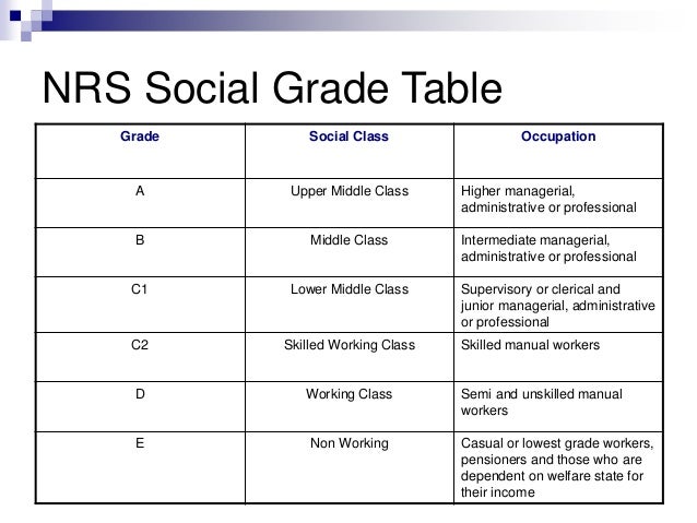
Social status

Secondary audience - teenage women - young girl character takes up most of the screen, she's not being sexualised


Social stratification


Demographic - a way of categorising an audience
Physcographics - the classification of people according to attitudes, aspirations and other physchological criteria

Aspirers : people who want to appear rich and attractive.
Reformers : people who want social change, are unimpressed by status and make decisions based on their values.
Explorers : adventurous people who like taking risks.
Mainstreamers : people who follow the crowd.
Strugglers : people who find it hard to achieve.
 Made for producers, not considering people as people, but as audiences

Saturday, 7 October 2017

Vampire Poster - Kiss of the Vampire


Kiss of the Vampire 1963:

Layout and design -

Z line is used: first the audience sees the title of the film, then the main characters (supposedly) and finally the list of actors. This ensures that the audience is informed of most of the information before they go to watch the movie.

The main characters take up the majority of the movie poster, dominating the middle third. But the movie name also encapsulates a lot of the space and it looks like the characters are almost being shoved out of the way by the text.

Images/photographs - camera shot type, angle & focus -


Illustration used to create the main image that is very graphic and detailed. ( E.g. the excessive blood references throughout the poster, on the character and the title) Gives us an idea of the the setting, time of day and era. For example, the poster is all very dark and this tells the audience that the majority of the movie could take place at night, which also connotes the evil surrounding the dark, emphasising the theme of horror.

A medium long shot is used to include all of the characters fully in the poster. This also helps to depict how alone these characters are as you can see clearly their relationship to the bleak surroundings. The audience then feels sympathy for the victims then especially as you can see how clearly helpless characters are in this movie when near a vampire. Foreshadows the idea of being hunted and alone. Also included the castle ( presumably  belonging to the vampires ) in the very far background, showing us once again how the victims are out of their territory.

As well as this, most of the poster is in focus (foreground and subjects), however some parts, such as in the background, are slightly less detailed and blurry. This creates the idea that there could be moments in the movie that are sneaky and not so clear as they could be clouded by the actions of other characters.

Colour -

Overall, the poster is has a very sooty and gloomy coloured, as created by the night-time setting which engulfs the advert. However there are the few splashes of colour to attract the audience's attention such as the golds and reds on the women character's dresses and skins. A bright yellow is also used in the poster to make a point and create a real selling point for the movie, as it is described as "in colour" which would have been new and exciting at the time of the creation. 

Lighting - 

Very dark ( night time ), the moon and the title brighten up the whole poster. The impeding title is almost like rays of light which seem to be harming the male vampire as he shields himself. Adding to the myth of vampires and partially explaining their weaknesses within the poster.

Costume - 

The costumes are typical of the era. The women are shown to be wearing these dresses which look very flimsy and with not that much to them. This sexualises women as well as evoking the idea that this movie could be slightly explicit in some way.

The man vampire is wearing very stereotypical vampire costume, matching the dominant ideology that a vampire is tall, of high social status ( well kept and well made looking clothes) and wears red and black clothes ( connotations = blood, romance and death). But, normally we see vampires to be very powerful. However here, he is not shown to be very powerful but rather timid and worried as he has this fearful expression on his face, using his cape as a barrier.

The kneeling man wears a white shirt, and his face is not really shown. The colour white depicts this idea of purity, which explains how he is a victim to these vampires. In addition to this, the fact that his face is hidden, the audience can only identify him as the victim, with no reason as to why he could be in the wrong, as we do not know who he is.

Graphics & logos - 
Small universal logo used in the bottom right of the poster, still in the z line, " a universal release ", could possibly be another selling pint of the advert.

Codes and conventions - 

Hermeneutic Codes: The moon and the fog help to create mystery as it shadows the truth in a way and hides what is really going on, makes the audience want to watch the movie and figure out what is being covered up.
Proairectic Codes: The red colours in the poster help the audience to connect ideas of romance, passion and blood as vampires are thought to be very seductive but predators to humans. Initial ideas from the title are developed through this proairectic code


Symbolic Codes: The woman being held up by the man vampire is shown to be very weak and submissive and a stark contrast to the other woman, who shows the most power in the whole poster. This juxtaposition challenges popular belief at the time that women need to be taken care of and were the weaker sex.

Composition - 

Main characters in the foreground, other important factors in the background (castle)

Language - 

"Kiss of the vampire" turns something sweet into something bad and also is a play on words to suggest that the kiss of a vampire is actually a bite. Doesn't sound nice or good.

Font size & type of font - 

Sans serif font. The title of the movie is created using a bold, white font with sharp/raw edges to connote the idea of vampire fangs. This idea is added to through the red blood-like drops that drip off the letter "V", emphasising the animalistic nature of the vampire.

Font throughout the poster is bold and the majority of the the letters are capitalised, and slightly stretched out in order to really jump out at the audience and grab their attention.

Analysis of narrative:


Genre iconography: Dramatic , excessive gestures connotative of conflict.

Binary oppositions: Beautiful women in white with aggressive expressions and gestures - opposition of what we expect vs what we get.

Disruption of equilibrium: Symbolic code of vampire biting woman - showing power of evil ( the vampire has control over these women )

Challenging stereotypes - connotations of powerful women, through symbolic, protective gesture. 

Hermeneutic code : cluttered and confusing collection of archetypes , we wonder what is going to happen next. "How did they all end up in this situation together?!"

Representation of women : women are sexualised - costumes are flimsy - the women on the left is shown to be submissive.

Friday, 6 October 2017

ADVERTS ANALYSIS

Anchor Spreadable Butter Advert:


  • What groups are represented in this advert?
Old and young people. Specifically old women, Posh women & Families, local characters but second generation immigrants. Makes the product appeal to many different audiences.
     -Families
     -Elderly people
     -Teenagers
     -Elderly immigrants

  • What assumptions are made about these groups of people?

      Old people are confused by technology - use of the midshot emphasises her confusion.
      Teenagers are very youthful and contrasting (binary opposition) to their granny - Mise en scene, they're wearing hoodies and hair is tied up, evoking the idea that teenagers are rude and sarcastic which is confirmed in their dialogue.

  • What ideologies are encoded in to this advert?
The butter brings the family together. Families should have this sort of humour between them to create the "perfect family"
Perfect family - Living with a grandparent, a son and a daughter, close knit. Very P O S I T I V E representation of the family.


Pot Noodle - You Can Make It Advert:


    • What groups are represented in this advert?                         Teenagers, Families, Children, Old People, Rich people & Poorer people, Working Class, Dreamers/Aspirational people, Black men, Gay men


    Sterotypical teenage boys - mise en scene : pens and pencils show that he's a student 

    Working Class - the paint is peeling and very dirty in this kid's room.

    Family - Midshot, lots of the characters are wearing their pyjamas. Very loud and shouty, uncivilised. Gold chains and hats as well as shabby clothes. Northern accent - lifestyle, used to living at home in a rough area with a B I G family. Difficult life & the desire to escape that life. Inspirational crescendo, the music is building up to something then it cuts ( rags to riches ) creating a binary opposition 

    Black Men - sterotypical rapper, does this weird movement with his mouth - sexually objectifying the ring boy, creates a binary opposition between the white lad and this black lad. The white guy is not cool and the black guy could possibly taking the mick.


  • What assumptions are made about these groups of people/ ideologies presented?
  • The main character is challenging dominant ideology - being a ring girl, doing a typical women's job and wearing women's clothes (Crossdresser), he could be gay

    Monday, 2 October 2017

    Genre and Intertexuality


    • Genre: A type of media product governed by implicit rules that are shared by the makers of the product and the audience for it

     G E N R E S   of    M U S I C

    Rap
    Trap
    Pop
    Classical
    Opera
    Rock
    Dubstep
    House
    Trance
    Jungle
    EDM
    Grime
    Indie
    Alternative
    Indian Classical
      Reggae  

    • Sub genre: A more specific type of genre.
    • Hybrid genre: A mixture of two or more genres to create a different genre all together.
    • Genre Paradigms: "The building blocks" of genre, also known as genre conventions.
    • Iconography: The familiar signs of genre.
    Intertextuality expands the audience base. E.g. The Simpsons makes references to other movies and tv shows throughout their episodes and seasons. It allows the audience to feel special - part of a sub group of people who spotted the reference. Paying homage to the classic films, can also piggyback on the most successful films.


    Newspapers and online REVISION

    Newspapers very often construct a binary opposition between left and right wing policies the times is vertical and horizontally integrated ...